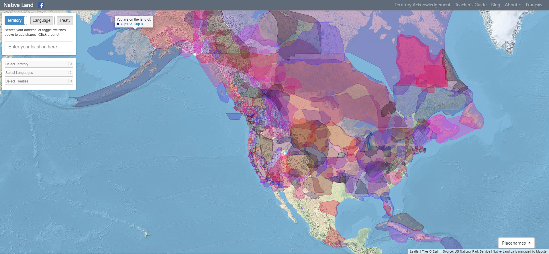
Native Land Digital strives to create and foster conversations about the history of colonialism, Indigenous ways of knowing, and settler-Indigenous relations, through educational resources such as our map and Territory Acknowledgement Guide. We strive to go beyond old ways of talking about Indigenous people and to develop a platform where Indigenous communities can represent themselves and their histories on their own terms. In doing so, Native Land Digital creates spaces where non-Indigenous people can be invited and challenged to learn more about the lands they inhabit, the history of those lands, and how to actively be part of a better future going forward together.
The Importance of Land
Land is something sacred to all of us, whether we consciously appreciate it or not — it is the space upon which we play, live, eat, find love, and experience life. The land is ever-changing and ever-shifting, giving us — and other creatures and beings on the earth — an infinite number of gifts and lessons.
For Native Land Digital, what we are mapping is more than just a flat picture. The land itself is sacred, and it is not easy to draw lines that divide it up into chunks that delineate who “owns” different parts of land. In reality, we know that the land is not something to be exploited and “owned”, but something to be honoured and treasured. However, because of the complexities of history, the kind of mapping we undetake is an important exercise, insofar as it brings an awareness of the real lived history of Indigenous peoples and nations in a long era of colonialism.
We aim to improve the relationship of people, Indigenous and non-Indigenous, with the land around them and with the real history and sacredness of that land. This involves acknowledging and righting the wrongs of history, and also involves a personal journey through the importance of connecting with the earth, its creatures, and its teachings.
Thus, while we make a strong effort to teach about colonialism and to bring forth Indigenous narratives, we also strive to integrate what is sometimes called an “Indigenous way of knowing” when it comes to the importance and sacredness of land in our daily lives. We hope to inspire people to gain a better understanding of themselves, their ancestors, and the world they live in, so that we can all move forward into a better future.
This is a chronological gallery of physical visualizations and related artifacts, maintained by Pierre Dragicevic and Yvonne Jansen.
https://citeseerx.ist.psu.edu/viewdoc/download?doi=10.1.1.208.6726&rep=rep1&type=pdf

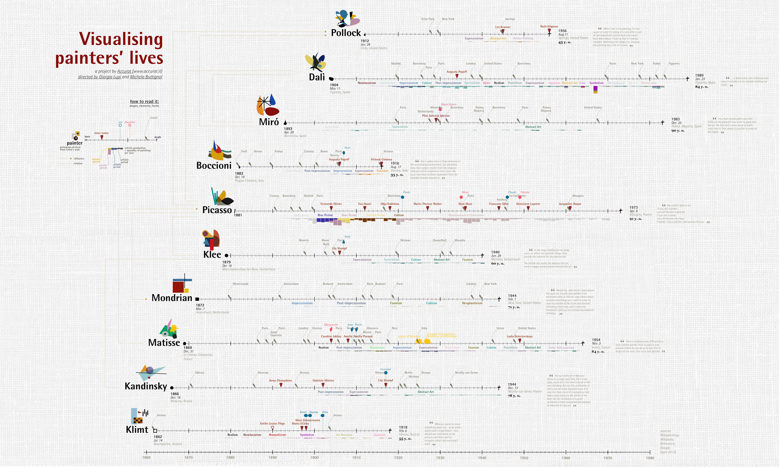
The visualization shows the most used colors of 50 artists. Each artist has their individual color footprint. The shown colors are aggregated and size doesn't represent the actual usage of the particular color by the artist to reduce the complexity inside the application.
You can select each color to find related colors – ones that the artist often used together with that color or other artists frequently used together with that color. If you like a color, you can copy the tone or add it to a collection and export it later.
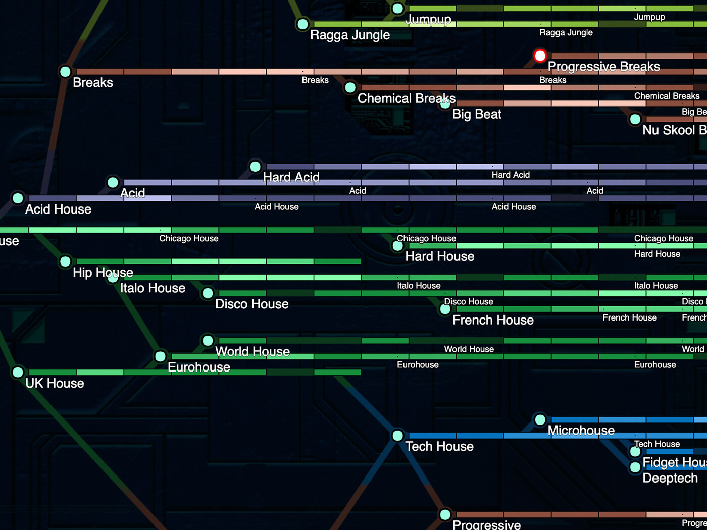
This guide favors authenticity over accuracy, and it aims to entertain before it informs. It is only as accurate as it feels it needs to be. It is constantly changing and it is infinitely mutable, so the map, the music, and my self-righteous opinions are all subject to change as I discover, investigate, and incorporate new knowledge and more music. Nothing is definitive.
This is an educational resource, not a music sharing service. There are no complete songs here. All tracks are low quality sub-2 minute samples. If you want the music, do the artists a solid and buy it from them through legitimate channels.
A painstaking investigation of Europe’s cave art has revealed 32 shapes and lines that crop up again and again and could be the world’s oldest code.


Histomap: a visualization of 4000 years of History, created in 1931 by John B. Sparks.
HyperCities makes possible for geographic maps to seamlessly merging the historical representations of the city in their current situation, and thus connecting the digital archives, maps, and stories with the physical world.
Everyone ever in the world is a visual representation of the number of people to have lived versus been killed in wars, massacres and genocide during the recorded history of humankind.
Many Wikipedia articles are tagged with geographic coordinates. Many have references to historic events. Cross referencing these two subsets and plotting them year on year adds up to a dynamic visualization of Wikipedia's view of world history.

Hand drawn autobiography time-line visualisation.
This piece of work is a bird's eye view of the history by scaling down a month length of time into one second. No letter is used for equal messaging to all viewers without language barrier. The blinking light, sound and the numbers on the world map show