![]()
The AntiMap is an Open Source creative toolset for recording and visualising your own data. The project currently consists of a smart phone utility application (AntiMap Log) for data capture, and a couple of web/desktop applications.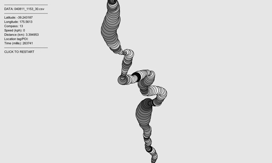
An interactive tool that depicts the 500 companies on Fortune Magazine's annual list of America's largest corporations.

WeatherSpark is a new type of weather website, with interactive weather graphs that allow you to pan and zoom through the entire history of any weather station on earth.
Le logiciel Lignes de temps met à profit les possibilités d’analyse et de synthèse offertes par le support numérique. Inspirées par les «timelines» ordinairement utilisées sur les bancs de montage numérique,
The Metro Wine Map of France, which re-draws the country’s wine appellations as stops on a regional subway line.
cinemetrics is about measuring and visualizing movie data, in order to reveal the characteristics of films and to create a visual “fingerprint” for them.
Almost 216 million people, or 3.15% of the world population, live outside their countries.
WikiMindMap is a tool to browse easily and efficiently in Wiki content, inspired by the mindmap technique.
Artist Aaron Koblin takes vast amounts of data and at times vast numbers of people and weaves them into stunning visualizations.
HyperCities makes possible for geographic maps to seamlessly merging the historical representations of the city in their current situation, and thus connecting the digital archives, maps, and stories with the physical world.
Everyone ever in the world is a visual representation of the number of people to have lived versus been killed in wars, massacres and genocide during the recorded history of humankind.
Living statistics – Many of us who have been following social media since the early 90s are very sensitive to today’s exponential growth in usage of the sharing web.
Many Wikipedia articles are tagged with geographic coordinates. Many have references to historic events. Cross referencing these two subsets and plotting them year on year adds up to a dynamic visualization of Wikipedia's view of world history.

Hand drawn autobiography time-line visualisation.
Conductor turns the New York subway system into an interactive string instrument. Using the MTA’s actual subway schedule, the piece begins in realtime by spawning trains which departed in the last minute.
Compelling form of photojournalism.
A massive central data source and a handy way to graphically compare nations.
When you enter phrases into the Google Books Ngram Viewer, it displays a graph showing how those phrases have occurred in a corpus of books.
David McCandless turns complex data sets (like worldwide military spending, media buzz, Facebook status updates) into beautiful, simple diagrams that tease out unseen patterns and connections.
A Video Report on Data Visualization by Geoff McGhee
The drawings below are a methodical interpretation of the first two chapters of A Thousand Plateaux : Capitalism and Schizophrenia by Gilles Deleuze and Felix Guattari.
Home of the Internet's most complete country profiles. This site contains detailed country statistics, charts, and maps compiled from multiple sources.
The Atlas of True Names reveals the etymological roots, or original meanings, of the familiar terms on today's maps of the World, Europe, the British Isles and the United States.
This piece of work is a bird's eye view of the history by scaling down a month length of time into one second. No letter is used for equal messaging to all viewers without language barrier. The blinking light, sound and the numbers on the world map show
More than any time in the history of the Web, incumbents in the network economy are consolidating their power and staking new claims to key points of control. Welcome to the first iteration of the Web 2.0 Summit's theme, Points of Control!
an HTML DOM Visualizer Applet
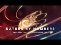
The movie Nature by Numbers created by Etérea [etereaestudios.com] is a beautifully illustrated animation focusing on remarkable geometrical and mathematical properties.
http://www.etereaestudios.com/docs_html/nbyn_htm/about_index.htm
Kaleido is a tool that is designed to help visual-thinkers program. You can use Kaleido to create personally meaningful visuals for your code. Kaleido allows individuals to plan, organize, and navigate code in the idiosyncratic way we each think.
All the blogs with cool data visualization eye candy
Data Visualization is a transversal discipline which harnesses the immense power of visual communication in order to explain, in an understandable manner, the relationships of meaning, cause and dependency which can be found among the great abstract masse
Box Office Receipts 1986 — 2008. Here's a look at how movies have fared at the box office, after adjusting for inflation.
sketchPatch allows people to play with programming in a easy and fun way. You can write your own programs and run them in the browser, share them, or collaborate with other people making new versions of their programs.
Personas shows you how the Internet sees you. An installation by Aaron Zinman.
Artist and computer scientist Jonathan Harris makes online art that captures the world's expression -- and gives us a glimpse of the soul of the Internet.
it reads the xml files that are being stored by the MSN, and makes a graphical display that allows to make comparisons between conversations with different people..
Synesketch is an artistic software library with synesthetic abilities, created by Uroi Krcadinac. It is a Web's first free open-source textual emotion recognition and visualization engine code that feels the words visually!
Below are 50 of the best data visualizations and tools for creating your own visualizations out there, covering everything from Digg activity to network connectivity to what s currently happening on Twitter.
WordSift is a tool that was created primarily for teachers. Mainly, think of it playfully - as a toy in a linguistic playground that is available to instantly capture and display the vocabulary structure of texts, and to help create an opportunity to talk
Reveals the privacy vulnerabilities of web different web browsers.
An experiment in organic software visualization.
http://vis.cs.ucdavis.edu/~ogawa/codeswarm
C++ library designed to assist the creative process by providing a simple and intuitive framework for experimentation.
ANOPTIQUE developpe et accompagne la mise en contexte cooperative de logiciels libres favorisant les pratiques de l' Intelligence Collective, en particulier dans le domaine de la visualisation d'information.
The InfoVis:Wiki project is intended to provide a community platform and forum integrating recent developments and news on all areas and aspects of Information Visualization.
form follows data - data visualization & visual communication
Martin Wattenberg is a researcher at IBM whose work focuses on visual explorations of culturally significant data. His algorithmic approach is informed by his background in mathematics.
WebTracer is an project based on the intention to visualise the structure of the web. There are many applications that analyse websites for structural integrity and diagnostic purposes, but few reveal the visual structure that web hypertext creates.
This work follows on suggestions made by Bill Cheswick, Bell Labs and Hal Burch, CMU in a paper about mapping and visualising the internet.
InfoScope is an interactive visualization tool to access, explore, and communicate large or complex datasets.
Visualization and interaction experiments I produced for my Masters Thesis Visual tools for the sociosemantic web
Videos of processing example