

What BirdNET-Pi Does
24/7 recording from any USB sound card/microphone
24/7 local BirdNET-Lite analysis
Automatically extracts the detected songs, chirps, and peeps from recordings
Creates spectrograms of each recorded bird sound
Enters each detection into a local SQlite database for storage and data visualization
Hosts its own Caddy web server so that the data can be accessed from any web browser or device (can be configured to be local only or can easily be made public to share with the world — check out the public installations below!)
Offers local Streamlit database analysis to visualize daily and long-term presence data
Live audio stream
BirdWeather.com integration
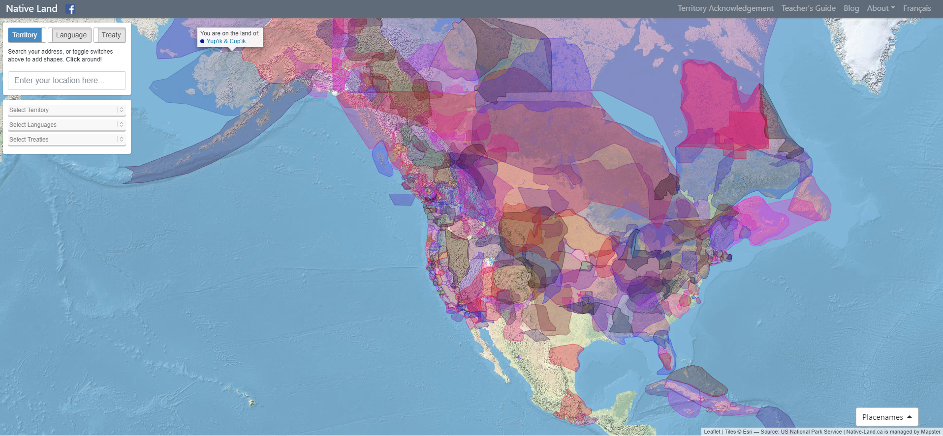
Native Land Digital strives to create and foster conversations about the history of colonialism, Indigenous ways of knowing, and settler-Indigenous relations, through educational resources such as our map and Territory Acknowledgement Guide. We strive to go beyond old ways of talking about Indigenous people and to develop a platform where Indigenous communities can represent themselves and their histories on their own terms. In doing so, Native Land Digital creates spaces where non-Indigenous people can be invited and challenged to learn more about the lands they inhabit, the history of those lands, and how to actively be part of a better future going forward together.
The Importance of Land
Land is something sacred to all of us, whether we consciously appreciate it or not — it is the space upon which we play, live, eat, find love, and experience life. The land is ever-changing and ever-shifting, giving us — and other creatures and beings on the earth — an infinite number of gifts and lessons.
For Native Land Digital, what we are mapping is more than just a flat picture. The land itself is sacred, and it is not easy to draw lines that divide it up into chunks that delineate who “owns” different parts of land. In reality, we know that the land is not something to be exploited and “owned”, but something to be honoured and treasured. However, because of the complexities of history, the kind of mapping we undetake is an important exercise, insofar as it brings an awareness of the real lived history of Indigenous peoples and nations in a long era of colonialism.
We aim to improve the relationship of people, Indigenous and non-Indigenous, with the land around them and with the real history and sacredness of that land. This involves acknowledging and righting the wrongs of history, and also involves a personal journey through the importance of connecting with the earth, its creatures, and its teachings.
Thus, while we make a strong effort to teach about colonialism and to bring forth Indigenous narratives, we also strive to integrate what is sometimes called an “Indigenous way of knowing” when it comes to the importance and sacredness of land in our daily lives. We hope to inspire people to gain a better understanding of themselves, their ancestors, and the world they live in, so that we can all move forward into a better future.
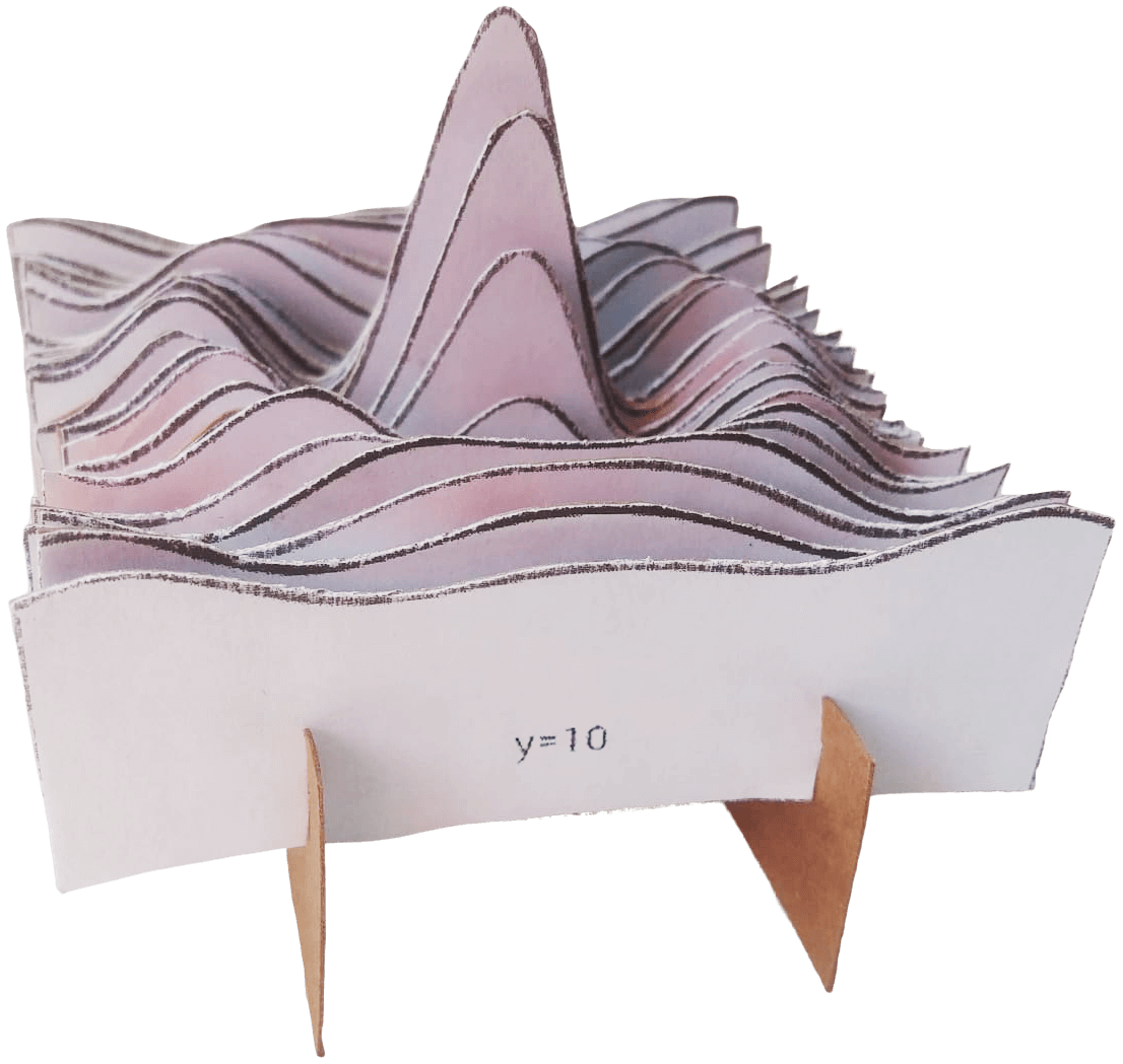
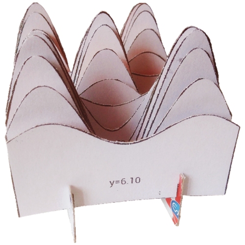
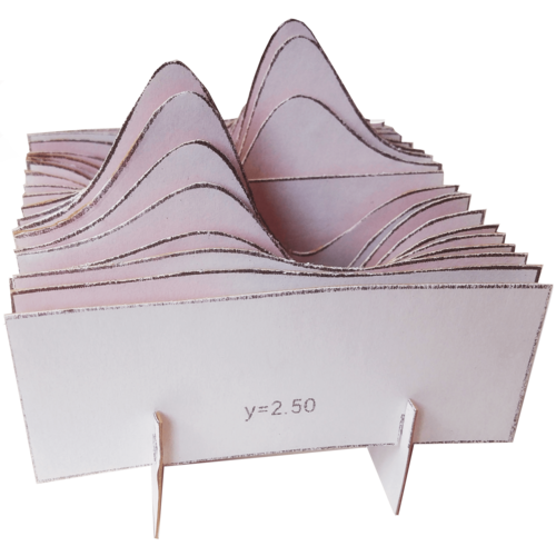
This is a chronological gallery of physical visualizations and related artifacts, maintained by Pierre Dragicevic and Yvonne Jansen.
https://citeseerx.ist.psu.edu/viewdoc/download?doi=10.1.1.208.6726&rep=rep1&type=pdf
https://www.atlasofplaces.com/research/infrastructure-patterns-i/
https://www.atlasofplaces.com/research/infrastructure-patterns-vii/

Atlas of Places is a public educational collection of Academia, Architecture, Cartography, Cinema, Essays, Painting, Photography and Research. Its objective is to question the meaning of places. It is curated according to continuously evolving philosophical, social and cultural beliefs. This is merely an occasional collection. Some works date from 1230, some from the recent past, some from the present. They have this characteristic in common that they are outlooks, in the truest sense of the word. In them will be found little more than the intention of clarifying a few ideas that might really be called political if that fine word, so attractive and exciting to the mind, did not arouse today so many great scruples and great repugnance.
Atlas of Places simply wishes to make a little clearer to itself the notions that it has received from others or that, like others, it has formed for itself — notions that everyone uses for thinking about human groups, their relations and difficulties with one another. The effort to clarify such matters is assuredly not the business of those men who practice or mix in them. This collection is the work of an amateur.
Atlas of Places is dedicated to those persons who have no system and belong to no party and are therefore still free to doubt whatever is doubtful and to maintain what is not.
Atlas of Places is curated day by day, the works shared do not pretend to show any organic development: the link between them is rather one of insistence and repetition. For while one doesn’t know whether things which are repeated are pleasing, one’s belief is that they are significant. And what is sought throughout this collection are significant features.
Atlas of Places produces cartography, satellite imagery and orthoimagery for exhibitions, editorial projects and various other mediums. This continuous production appears in the Research collection. If you wish to collaborate, please scroll down to the “Collaboration” section below.
Atlas of Places originated in the Pyrénées-Orientales during the summer of 2015 and is edited by Thomas Paturet.
All Sci Fi novels published since 1900 were scraped from Good Reads, and for each novel, all reader comments, plot descriptions, and user-generated tags were compiled. Keywords and concepts were added to each novel by parsing the text described above and mapping them to a curated dictionary of SciFi keywords and concepts. 2,633 novels published since 1990 had at least 50 reviews and contained at least one keyword from the keyword corpus.
After keyword enhancement, a book network was created by linking novels if they share similar keyword. Network clusters identify Keyword Themes - or groups of similar books that are labeled most commonly shared keywords in the group.
The network was generated using the open source python 'tag2network' package, and visualized here using 'openmappr''. The scripts for analyzing this dataset are available at https://github.com/ericberlow/SciFi
This is a collaborative project of Bethanie Maples, Srini Kadamati, and Eric Berlow
NOTE - This visualization performs best in Chrome and Safari browsers full screen - and is not optimized for the small screens of mobile devices.
How to Navigate this Network:
Click on any node to to see more details about it.
Click the whitespace or 'Reset' button to clear any selection.
Use the Snapshots panel to navigate between views.
Use the Filters panel to select nodes by any  combination of attributes.
Click the 'Subset' button to restrict the data to the selected nodes - The Filters panel will then show a summary of that subset.
Use the List panel to see a sortable list of any nodes selected or subset. You can also browse their details one by one by clicking on them in the list.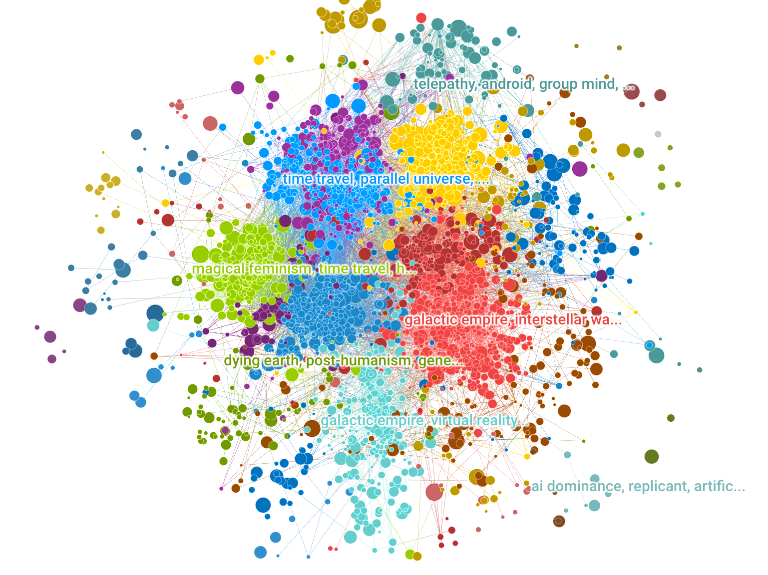
EmotiBit is a wearable sensor module for capturing high-quality emotional, physiological, and movement data. Easy-to-use and scientifically-validated sensing lets you enjoy wireless data streaming to any platform or direct data recording to the built-in SD card. Customize the Arduino-compatible hardware and fully open-source software to meet any project needs!
Optical illusions don’t “trick the eye” nor “fool the brain”, nor reveal that “our brain sucks”, … but are fascinating!
They also teach us about our visual perception, and its limitations. My selection emphazises beauty and interactive experiments; I also attempt explanations of the underlying visual mechanisms where possible.
Returning visitor? Check →here for History/News
»Optical illusion« sounds derogative, as if exposing a malfunction of the visual system. Rather, I view these phenomena as highlighting particular good adaptations of our visual system to its experience with standard viewing situations. These experiences are based on normal visual conditions, and thus under unusual contexts can lead to inappropriate interpretations of a visual scene (=“Bayesian interpretation of perception”).
If you are not a vision scientist, you might find my explanations too highbrow. That is not on purpose, but vision research simply is not trivial, like any science. So, if an explanation seems gibberish, simply enjoy the phenomenon 😉.
https://github.com/msieg/deep-music-visualizer
https://www.instagram.com/deep_music_visualizer/
https://www.youtube.com/watch?v=L7R-yBZ5QYc
Want to make a deep music video? Wrap your mind around BigGAN. Developed at Google by Brock et al. (2018)¹, BigGAN is a recent chapter in a brief history of generative adversarial networks (GANs). GANs are AI models trained by two competing neural networks: a generator creates new images based on statistical patterns learned from a set of example images, and a discriminator tries to classify the images as real or fake. By training the generator to fool the discriminator, GANs learn to create realistic images.

The visualization shows the most used colors of 50 artists. Each artist has their individual color footprint. The shown colors are aggregated and size doesn't represent the actual usage of the particular color by the artist to reduce the complexity inside the application.
You can select each color to find related colors – ones that the artist often used together with that color or other artists frequently used together with that color. If you like a color, you can copy the tone or add it to a collection and export it later.
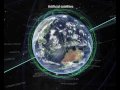
A visualization of global weather conditions
forecast by supercomputers
updated every three hours

ocean surface current estimates
updated every five days
ocean surface temperatures and
anomaly from daily average (1981-2011)
updated daily
ocean waves
updated every three hours
aurora
updated every thirty minutes
This guide favors authenticity over accuracy, and it aims to entertain before it informs. It is only as accurate as it feels it needs to be. It is constantly changing and it is infinitely mutable, so the map, the music, and my self-righteous opinions are all subject to change as I discover, investigate, and incorporate new knowledge and more music. Nothing is definitive.
This is an educational resource, not a music sharing service. There are no complete songs here. All tracks are low quality sub-2 minute samples. If you want the music, do the artists a solid and buy it from them through legitimate channels.

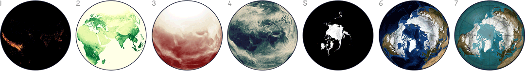
NASA publishes many Earth datasets at monthly time scales, and this GIF uses one frame per month to show the fluctuating seasons. The animation focuses mainly on data about Arctic sea ice and vegetation, but it was hard to choose - NASA has many other beautiful seasonal datasets, like fire, temperature, or rainfall.
Sustainability practitioners have long relied on images to display relationships in complex adaptive systems on various scales and across different domains. These images facilitate communication, learning, collaboration and evaluation as they contribute to shared understanding of systemic processes. This research addresses the need for images that are widely understood across different fields and sectors for researchers, policy makers, design practitioners and evaluators with varying degrees of familiarity with the complexity sciences. The research identifies, defines and illustrates 16 key features of complex systems and contributes to an evolving visual language of complexity. Ultimately the work supports learning as a basis for informed decision-making at CECAN (Centre for the Evalutation of Complexity Across the Nexus) and other communities engaged with the analysis of complex problems.
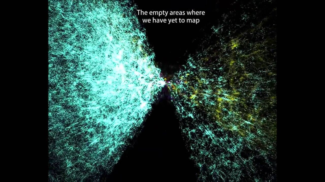
The Known Universe takes viewers from the Himalayas through our atmosphere and the inky black of space to the afterglow of the Big Bang. Every star, planet, and quasar seen in the film is possible because of the world's most complete four-dimensional map of the universe, the Digital Universe Atlas that is maintained and updated by astrophysicists at the American Museum of Natural History. The new film, created by the Museum, is part of an exhibition, Visions of the Cosmos: From the Milky Ocean to an Evolving Universe, at the Rubin Museum of Art in Manhattan through May 2010.
Data: Digital Universe, American Museum of Natural History
Visualization Software: Uniview by SCISS
A painstaking investigation of Europe’s cave art has revealed 32 shapes and lines that crop up again and again and could be the world’s oldest code.


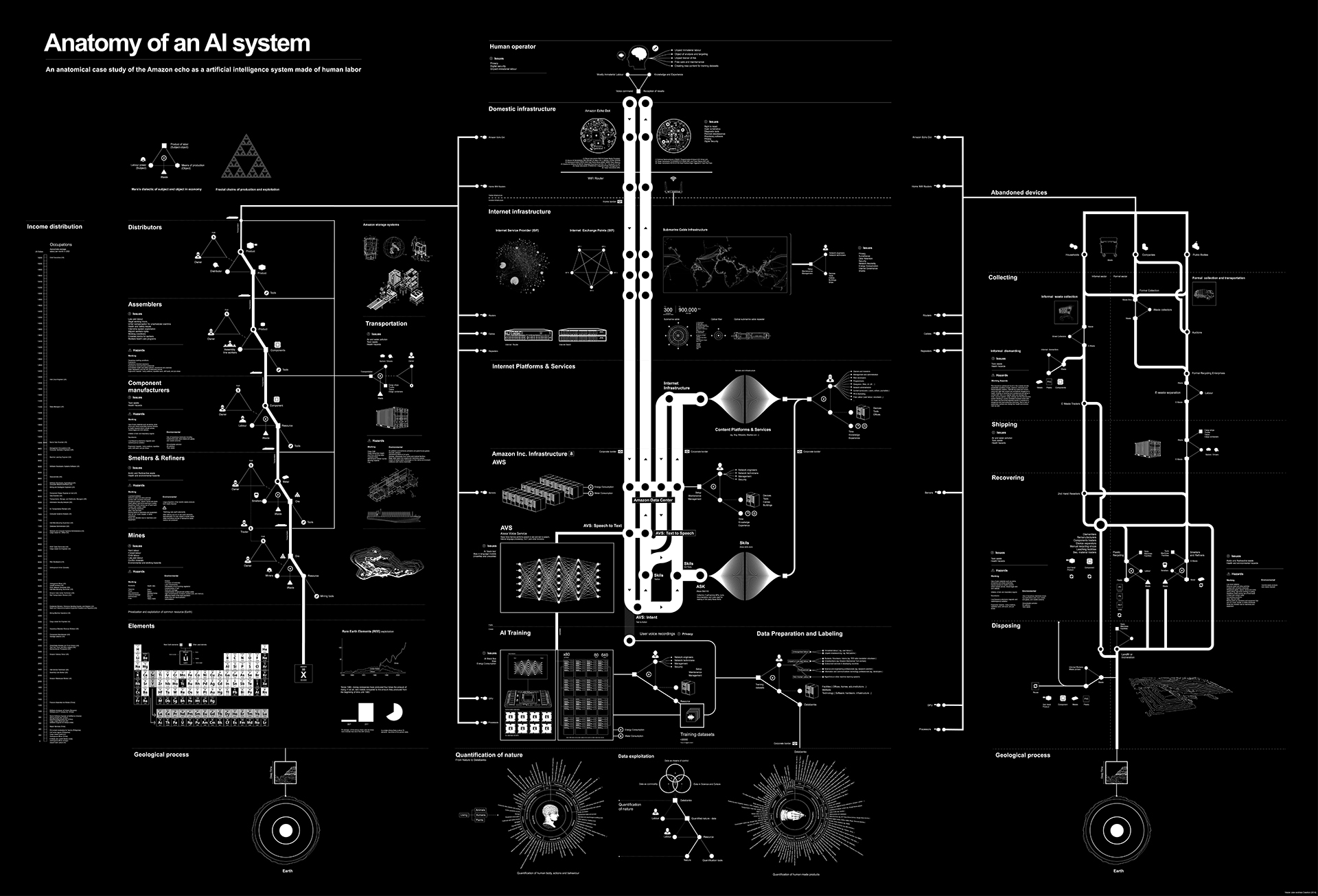
An anatomical case study of the Amazon echo as a artificial intelligence system made of human labor

The Electricity Map is developed and maintained by Tomorrow, a small Danish/French start-up company. Our goal is to help humanity reach a sustainable state of existence by quantifying, and making widely accessible, the climate impact of the daily choices we make.