Music Theory for Musicians and Normal People by Toby W. Rush
This collection is a work in progress, but if you would prefer, you can download all the current pages as a single PDF.
An interactive 3D visualization of the stellar neighborhood, including over 100000 nearby stars.
The latest update to the asteroid discovery video, now at UHDTV resolutions and with a voiceover explaining what's going on.
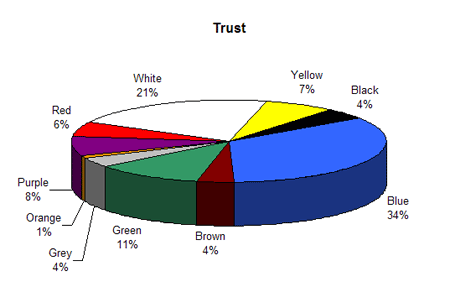
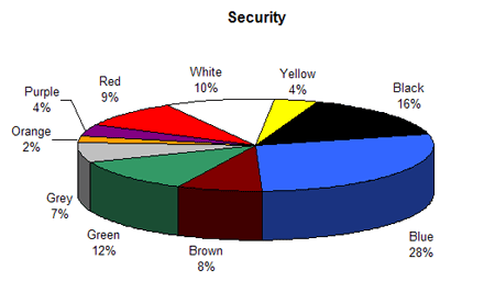
This article was researched by George Weber in the early 1990s and written up in 1995. It was first published in the now sadly defunct and still missed Language Today by the magazine's editor, Geoffrey Kingscott (a founder member of the Andaman Association), in December 1997 (Language Monthly, 3: 12-18, 1997, ISSN 1369-9733).
Associations with color are defined, in part by Faber Birren (the author of Color Psychology and Color Therapy) by our senses, language, objects (or forms), and personality characteristics. color conveys moods which attach themselves to human feelings and our psychic make-up in an almost automatic fashion. This section presents the results of color associations and how they compare to other published studies.
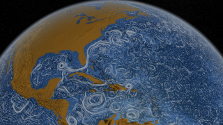
This visualization shows ocean surface currents around the world during the period from June 2005 through Decmeber 2007. The visualization does not include a narration or annotations; the goal was to use ocean flow data to create a simple, visceral experience.
The Social Collider reveals cross-connections between conversations on Twitter.
With the Internet's promise of instant and absolute connectedness, two things appear to be curiously underrepresented: both temporal and lateral perspective of our data-trails. Yet, the amount of data we are constantly producing provides a whole world of contexts, many of which can reveal astonishing relationships if only looked at through time.
This experiment explores these possibilities by starting with messages on the microblogging-platform Twitter. One can search for usernames or topics, which are tracked through time and visualized much like the way a particle collider draws pictures of subatomic matter. Posts that didn't resonate with anyone just connect to the next item in the stream. The ones that did, however, spin off and horizontally link to users or topics who relate to them, either directly or in terms of their content.
The Social Collider acts as a metaphorical instrument which can be used to make visible how memes get created and how they propagate. Ideally, it might catch the Zeitgeist at work.
Visualization of the market place, by size and colors
A visualization of money by size by Xkcd
![]()
The AntiMap is an Open Source creative toolset for recording and visualising your own data. The project currently consists of a smart phone utility application (AntiMap Log) for data capture, and a couple of web/desktop applications.
An interactive tool that depicts the 500 companies on Fortune Magazine's annual list of America's largest corporations.

WeatherSpark is a new type of weather website, with interactive weather graphs that allow you to pan and zoom through the entire history of any weather station on earth.
Le logiciel Lignes de temps met à profit les possibilités d’analyse et de synthèse offertes par le support numérique. Inspirées par les «timelines» ordinairement utilisées sur les bancs de montage numérique,
The Metro Wine Map of France, which re-draws the country’s wine appellations as stops on a regional subway line.
cinemetrics is about measuring and visualizing movie data, in order to reveal the characteristics of films and to create a visual “fingerprint” for them.
Almost 216 million people, or 3.15% of the world population, live outside their countries.
WikiMindMap is a tool to browse easily and efficiently in Wiki content, inspired by the mindmap technique.
Artist Aaron Koblin takes vast amounts of data and at times vast numbers of people and weaves them into stunning visualizations.
HyperCities makes possible for geographic maps to seamlessly merging the historical representations of the city in their current situation, and thus connecting the digital archives, maps, and stories with the physical world.
Everyone ever in the world is a visual representation of the number of people to have lived versus been killed in wars, massacres and genocide during the recorded history of humankind.
Living statistics – Many of us who have been following social media since the early 90s are very sensitive to today’s exponential growth in usage of the sharing web.
Many Wikipedia articles are tagged with geographic coordinates. Many have references to historic events. Cross referencing these two subsets and plotting them year on year adds up to a dynamic visualization of Wikipedia's view of world history.

Hand drawn autobiography time-line visualisation.
Conductor turns the New York subway system into an interactive string instrument. Using the MTA’s actual subway schedule, the piece begins in realtime by spawning trains which departed in the last minute.
Compelling form of photojournalism.
A massive central data source and a handy way to graphically compare nations.
When you enter phrases into the Google Books Ngram Viewer, it displays a graph showing how those phrases have occurred in a corpus of books.
David McCandless turns complex data sets (like worldwide military spending, media buzz, Facebook status updates) into beautiful, simple diagrams that tease out unseen patterns and connections.
A Video Report on Data Visualization by Geoff McGhee
The drawings below are a methodical interpretation of the first two chapters of A Thousand Plateaux : Capitalism and Schizophrenia by Gilles Deleuze and Felix Guattari.
Home of the Internet's most complete country profiles. This site contains detailed country statistics, charts, and maps compiled from multiple sources.
The Atlas of True Names reveals the etymological roots, or original meanings, of the familiar terms on today's maps of the World, Europe, the British Isles and the United States.
This piece of work is a bird's eye view of the history by scaling down a month length of time into one second. No letter is used for equal messaging to all viewers without language barrier. The blinking light, sound and the numbers on the world map show
More than any time in the history of the Web, incumbents in the network economy are consolidating their power and staking new claims to key points of control. Welcome to the first iteration of the Web 2.0 Summit's theme, Points of Control!
an HTML DOM Visualizer Applet

The movie Nature by Numbers created by Etérea [etereaestudios.com] is a beautifully illustrated animation focusing on remarkable geometrical and mathematical properties.
http://www.etereaestudios.com/docs_html/nbyn_htm/about_index.htm
Kaleido is a tool that is designed to help visual-thinkers program. You can use Kaleido to create personally meaningful visuals for your code. Kaleido allows individuals to plan, organize, and navigate code in the idiosyncratic way we each think.
All the blogs with cool data visualization eye candy
Data Visualization is a transversal discipline which harnesses the immense power of visual communication in order to explain, in an understandable manner, the relationships of meaning, cause and dependency which can be found among the great abstract masse


